The Chart
 Our good friend, the chart. Without it, no FM debate is worth a darned, and it is the first and most effective entry point into the conversation. “Got Chart?” is the same as writing “Put up or shut up.” The neat thing is that the experten all have charts for the same aircraft that say different things. Every single one of them is credible within their own rights, and all of them are wrong in that each applies generalizations to the whole of a population of aircraft through the testing of an individual of one.
The designers and pilots of the time knew this, of course, which is why they gave guidance in the form of generalizations that fudged five or ten percent on the side of safety to what the charts said. If a tested plane entered a stall at 90 MPH, they’d put up a placard warning that stalls may happen at 95 or 100 MPH.
Today we have the Internet and computer simulations. No such common sense is required.
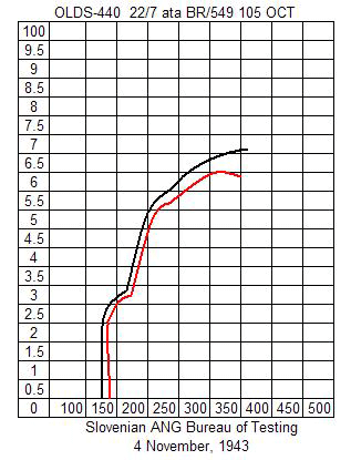
Anyhow, charts usually look something like this:

What does it mean? I have no idea either! It could be bladder pressure versus cups of coffee for all I know. But they all look something like this, with multiple lines for the same plane to represent some difference. Maybe the pilot was wearing red pants that bunched up at 6,000 meters altitude… or is that 3,000? Labeling X and Y axis on charts doesn’t seem to be a requirement to these things, nor are they user friendly.
Then again, the charts, when made, were drawn up by engineers for engineers and had a big red TOP SECRET written on the outside of the folder. They weren’t writing for you and me to discuss and compare over the Internet as an afternoon’s diversion.
Anyhow, you gotta have charts in an FM debate. “Where’s the Chart?” is a good way to jump in to the mix. Don’t worry; you don’t have to actually be able to read it. Others will do it for you.
However, since you knew to ask for the chart, you’re clearly knowledgeable enough to sit in on the bull session.
Related Posts:

Related posts:
 Falcon Flight Model Evolution
 Page 2
Falcon Flight Model Evolution Page 3
Falcon Flight Model Evolution Page 4
Falcon Flight Model Evolution Page 5
Falcon Flight Model Evolution
Falcon Flight Model Evolution Page 2
Falcon Flight Model Evolution Page 3
Falcon Flight Model Evolution Page 4
Falcon Flight Model Evolution Page 5
 How to Participate in Flight Model / Damage Model Debates
 Page 2
How to Participate in Flight Model / Damage Model Debates Page 4
How to Participate in Flight Model / Damage Model Debates
How to Participate in Flight Model / Damage Model Debates Page 2
How to Participate in Flight Model / Damage Model Debates Page 4